Inslee Unveils COVID “Risk Assessment Dashboard”
Gov. Inslee sent a release out Monday, announcing the state has a new COVID-19 "Risk Assessment Dashboard."
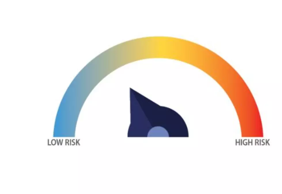
According to the site, this will make it easier for "Washin'-tonians" (as he says it) to understand where the state is risk-wise with COVID-19. The site shows a series of five "dials", similar to graphs used for fire danger by various land management agencies; they range from blue-green to red-orange to indicate "danger."
The site lists:
- COVID-19 DIsease activity
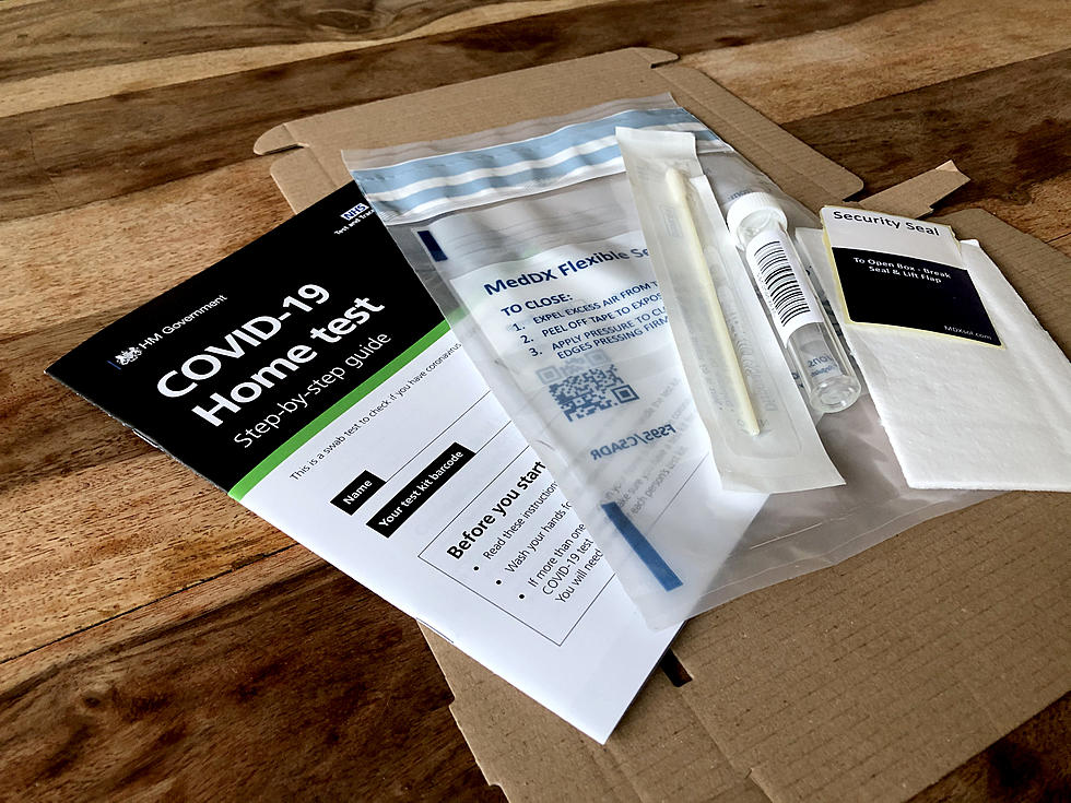
- Testing availability and capacity
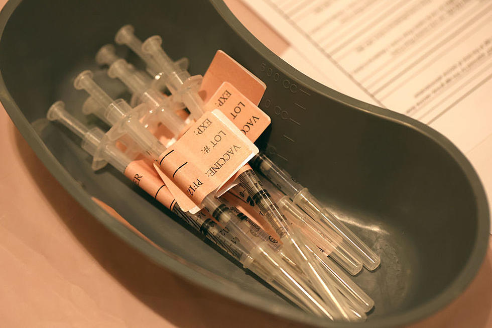
- case and contact investigations (his controversial trace and test)
- risk to vulnerable populations
- health care system readiness
It is interesting to note that of these five, disease activity, health care system readiness and risk to vulnerable populations are either noticeably or well below dangerous levels. However, Inslee has shown insistence upon getting testing and his contact investigations into the 'safe' zone before he will allow our economy and lives to return to 100% normal.
As for the risk to vulnerable populations, it makes sense to monitor long term care facilities and assisted care, especially for seniors and those with serious health issues. But it also includes what is called demographic and "equity" data. Apparently COVID-19 re-open decisions are being evaluated, at least in part, by ethnic breakdowns and other related cultural data. Exactly how that information is part of the equation is not known, has not been revealed.
To see the assessment page for yourself, click on the button below.

More From 870 AM KFLD