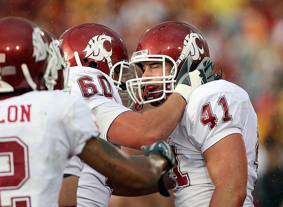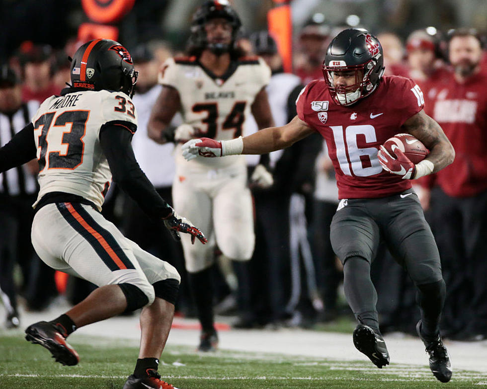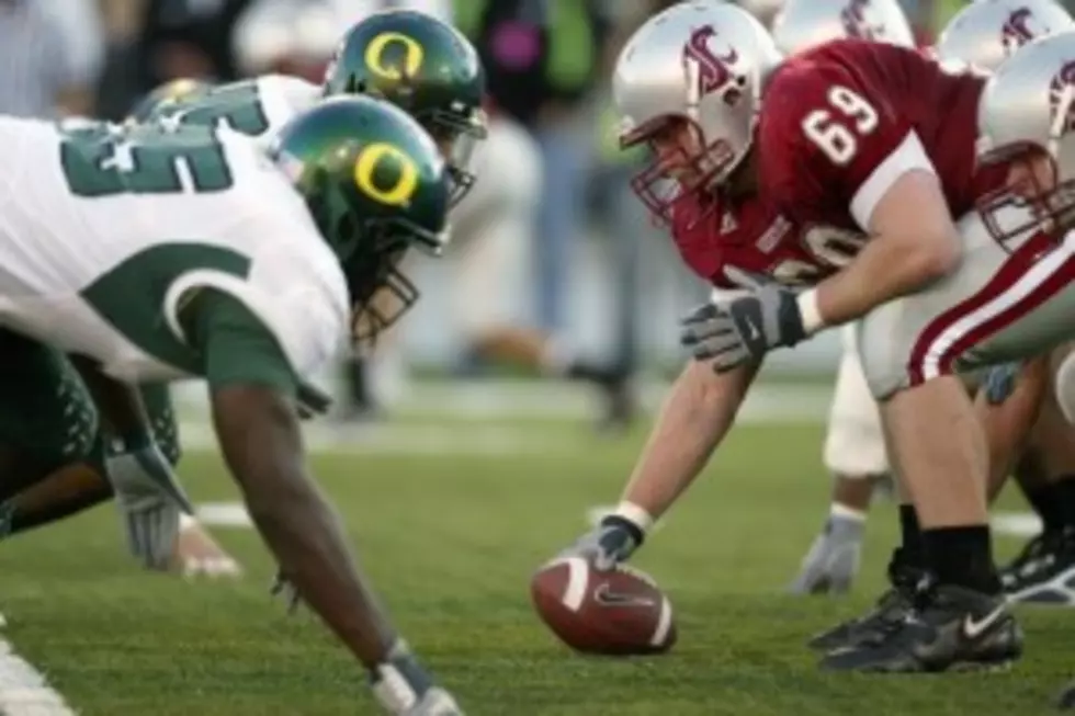
WSU Ugliest Uniforms In Pac-10? Survey Claims So.
According to a survey done by the Wall Street Journal, WSU has the ugliest football uniforms in the Pac-10.
Why? According to several graphic designers, the font, or style, of the numbers on the front and back of the jerseys. The artists said WSU's current look is 'retro' but the numbers are trying to be modern. Conversely, the Wall Street survey voted Oregon's the best looking. The Ducks, with their 17 kajillion different uniform combinations courtesy of the deep pockets of Nike, started the current rave of uniform looks across the country.
Other schools making the ugly list included UCLA, Clemson and Baylor(!). Rather interesting, because UCLA and Baylor are relatively unchanged over the decades. Another interesting note, an online poll at Northwest Cable News shows while the Cougars AND Huskies at 2nd and 3rd on the ugly list, 39% of the votes (more than 2-1 margin) felt Oregon's were the worst. But you must consider, NWCN is a west side based media outfit, and no doubt a lot of the uniform votes were more directed at people who are not Duck fans, as opposed to perhaps their view on the uniform.
With all due respect to our friends in Oregon, sometimes the Duck's unis resemble the creations of an artist recovering from mixing alcohol and prescription medication. Our choice for best? Alabama and Penn State. When you're THAT good for THAT long, it doesn't matter what your uniform looks like...you just crush everyone. We have included some images of UCLA, Penn State, Alabama, and what WE think is the ugliest uniform, the 'new' look of the University of Maryland.
More From 870 AM KFLD